


Dark mode started as more of a novelty than a standard. Since dark mode’s release on mobile in 2019, it’s achieved impressively fast adoption.
Dark mode’s adoption has been so fast, in fact, that by April 2019, a survey conducted by a dark mode developer reported that 82.7% of users preferred dark mode. In 2020, polling data from Android Authority revealed that 91.8% of their readers use dark mode to some extent.
Self-reported polling numbers may not be exact, but the bottom line is that some portion of your email subscribers are going to open your emails in dark mode.
That could cause problems in your email marketing if your emails aren’t designed to be dark mode friendly. Fortunately, there are ways to make sure your emails display correctly in dark mode.
We’ll break down how to design emails for dark mode, starting with the basics of dark mode email.
What is dark mode?
Dark mode is a reversed color scheme that displays icons, text, and certain UI elements in light colors over a dark background. The most common operating systems offer dark mode, and many apps also have dark mode settings which can be enabled outside of the OS dark mode setting.
Many people prefer dark mode because it reduces blue light exposure and can reduce eye strain.
Each OS and app developer has their own method for creating the dark mode color scheme, which is important, so we’ll revisit this shortly.
But, how likely is it that your emails will be opened in dark mode?
It’s tricky to get precise data on how many emails are opened in dark mode, since only WebKit-based email clients report dark mode email opens.
But, a study of 100,000 email opens found that 12% of emails were opened in dark mode.
Data from Email On Acid shows between 5.8% and 11.5% of emails being opened in dark mode.
These numbers are also likely understated.
It’s easiest to detect dark mode email opens on Apple devices, where WebKit-based email clients are most common. But, as Android Authority reported, Android users tend to prefer dark mode.
This means that the proportion of dark mode opens is probably very high in email clients where it’s not reported whether or not the email is opened in dark mode. It’s estimated that closer to 25% of emails are opened in dark mode, when you account for non-WebKit email clients.
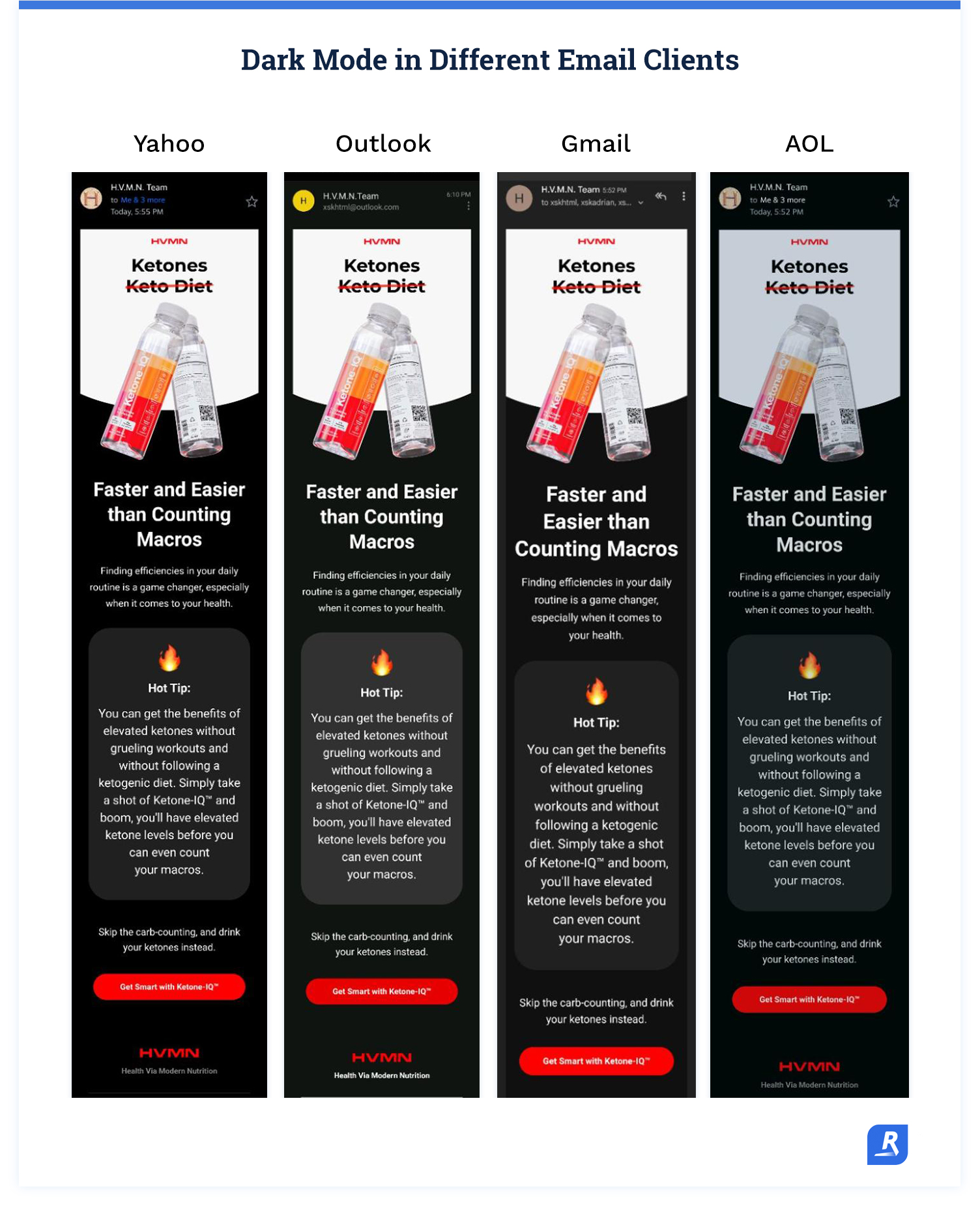
All of these email clients offer dark mode settings:
- Apple Mail (iPhone, iPad, and desktop versions)
- Gmail (iOS and Android versions)
- Outlook (iOS, Android, and desktop versions)
- Outlook.com
- Yahoo! mail
- Aol
- Hey.com
Even if your subscriber base skews heavily toward one email client or another, you’re not dodging dark mode.
So, yes, it’s worth it to design your emails for light & dark mode.
How does dark mode impact email design?
As we mentioned earlier, every operating system and email client inverts colors for dark mode differently. This makes it difficult to predict exactly how your emails will look for every subscriber:
The good news is that all of these dark mode inversion algorithms fall into one of two broad categories: partial color invert and full color invert.
Partial color invert
Partial color invert changes areas with light backgrounds and dark text or objects to dark backgrounds with light text or objects. However, areas that already have a dark background are left as-is.
This method tends to be the least invasive. Often, light mode email designs will be legible in partial color conversion dark mode.
Obviously, this isn’t always the case, but partial color invert dark mode changes fewer colors and is less likely to make emails display incorrectly.
Full color invert
Full color invert basically just changes all the light colors to dark colors and dark colors to light colors. This method is the most likely to cause your emails to display incorrectly. Fortunately, full color invert dark mode is less common than partial color invert.
Changing dark backgrounds to light backgrounds kind of defeats the purpose of dark mode. So apps and email clients that use full color inversion usually try to make more subtle color changes.
Even so, full color invert changes all (or at least most of) the colors in your email.
Also, some of the more popular email clients, such as iOS Gmail, use full color invert dark mode. That means the safest route is to design your emails to be handled by full color invert, and they’ll display just fine in partial color invert dark mode.
How to design dark-mode friendly emails
The big challenge in designing emails to display well in dark mode is accounting for all the different email clients and the proprietary dark mode color inversion algorithms.
The most efficient way to create emails for dark mode is to integrate some design fundamentals into your email production workflow.
That way, your usual email creation process creates emails that display in light and dark mode, regardless of which email client a subscriber uses.
Keep text as text
It’s generally unwise to use images to display text. Standard text objects have fewer potential display issues than images. Using image files in place of plain text creates unnecessary headaches in normal email development, without dark mode styling.
When it comes to dark mode, email clients are much better at recognizing text objects and inverting the colors while keeping the text legible. Color inversion with images is much more complicated and prone to errors that cause email display problems.
Whenever you’re displaying text, do it with a text object. Save the image files for displaying—you know—imagery.
If you must cut text as an image, do so with a transparent background. And in some cases, you'll need to add an outline to the text that is the same color as the background. For example, if you have black text on a white background, add a 2 pixel stroke to the text so that it remains visible when inverted.
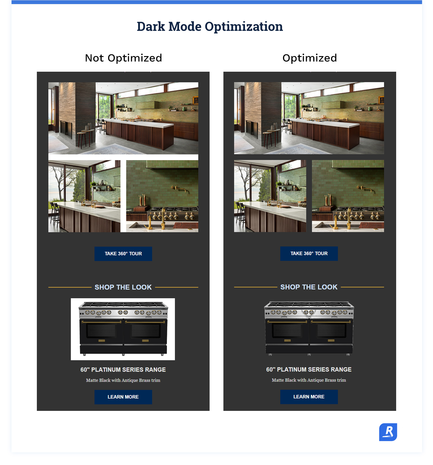
Use dark mode-compatible images
Obviously, not everything can be displayed as text. Imagery is important in email, especially marketing emails. However, images only help if they look right.
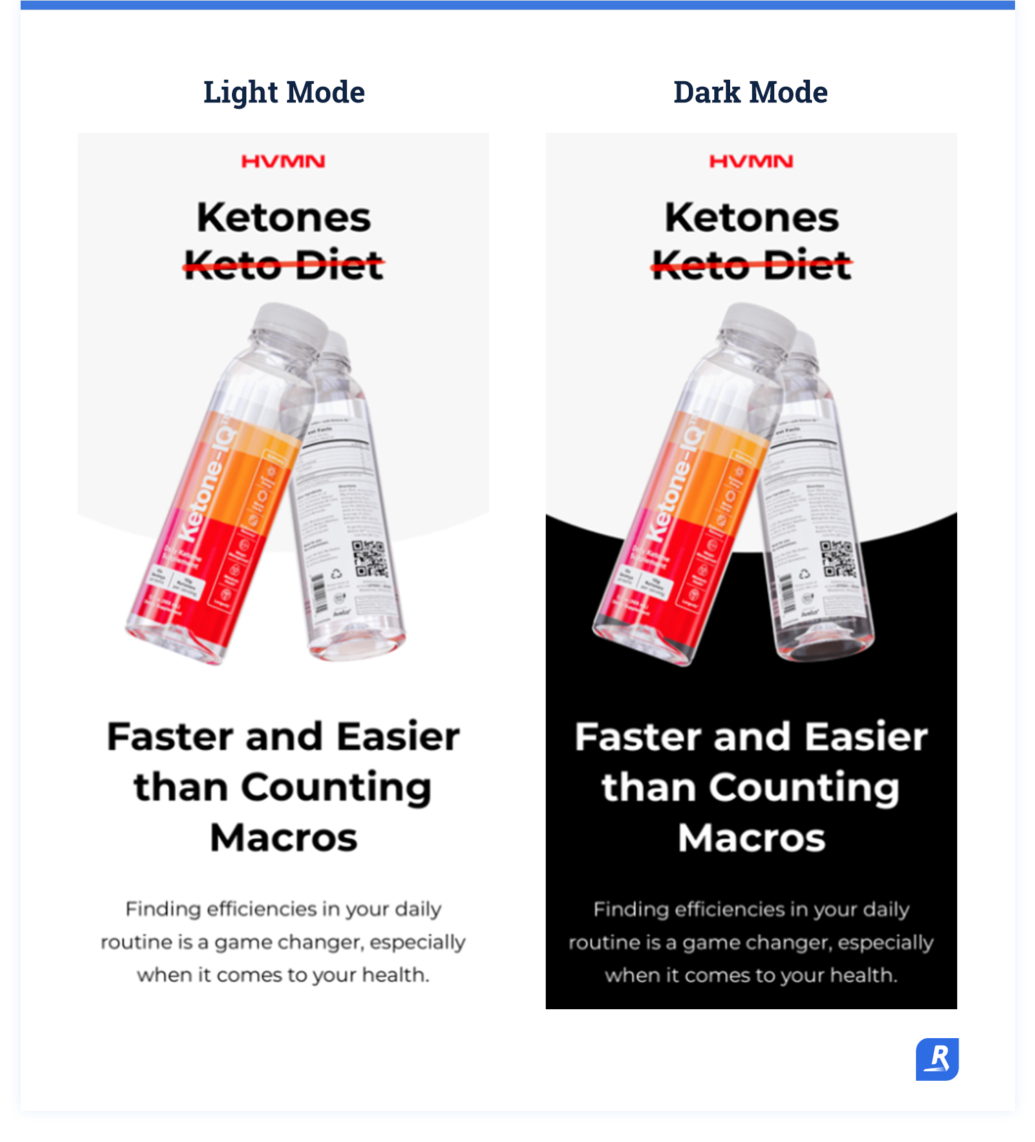
If you want the backgrounds in your images to match the background for the text, use .PNG files with transparent backgrounds. This is the simplest and most reliable way to make sure your images display correctly.
If you use a .JPG or some other file type with a background that matches the background for text and other objects in light mode, the image background often gets mysteriously inverted to a different color than the other backgrounds.
At best, this causes the edges of your images to show up in the email. At worst, it causes the image itself to disappear into the dark mode background.
If you use .PNG images with transparent backgrounds, the color inversion is more predictable, and you can create images that show up against both light and dark mode backgrounds.
Create high-contrast images
In addition to using transparent backgrounds, it’s best if you use image objects that contrast with light and dark backgrounds.
Dark gray and black are the most common dark mode background colors. There are plenty of colors that stand out against these dark colors and also show up on white backgrounds.

However, if your image is hard to see against a dark color, add a glow or an outline that matches your light mode background color.
The outline or glow effect will disappear in light mode, when your default background color displays. In dark mode the effect keeps the image from being difficult to see or completely disappearing.
This fundamental is especially important if you must use an image to display text for some reason. Text in images is especially susceptible to disappearing if there’s no highlighting to keep it visible in dark mode.
Enable dark mode for email clients that support it
There are two major email clients that offer some control over how dark mode displays without any hacks or non-standard email development. Apple Mail and Outlook have dark mode settings that you can enable in your emails.
However, these email clients don’t give you full control over how dark mode displays. They just give you the option to add a bit of code to your emails that tells the email client you’ve created a dark mode style, then the email client messes with the colors in your emails slightly less.
Ultimately, this just means that you should only declare dark mode in your emails once you’ve implemented the three fundamentals we outlined above. Declaring dark mode in your email code can actually make your emails look worse if you haven’t added dark mode styling.
For instance, activating dark mode in Apple Mail simply limits the dark mode color inversion to the background and leaves the other email elements as is. This can cause display issues if your images aren’t optimized for dark mode or you’re using images to display text.
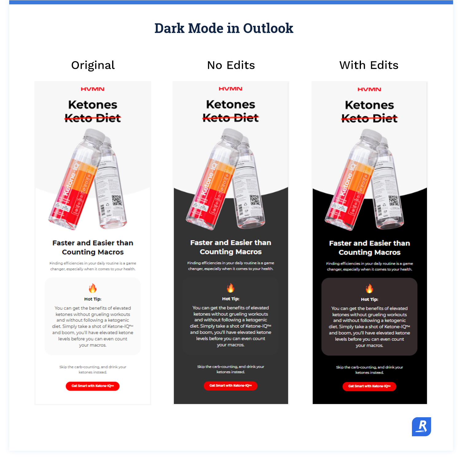
In Outlook, you can specify which colors to use in dark mode, and Outlook will use those colors, or colors very close to your specified colors, when your emails display in dark mode.
With all that said, add these lines of code to activate dark mode in Apple Mail and Outlook:
Apple Mail dark mode meta code:
Then declare your colors using this code:
The first line of code activates dark mode. The second line of code enables you to specify which colors to display in dark mode (colors are declared after the @media line).
Specifying which colors to display in dark mode creates the dark mode styling for Apple Mail, and you must declare your dark mode colors for your emails to display correctly.
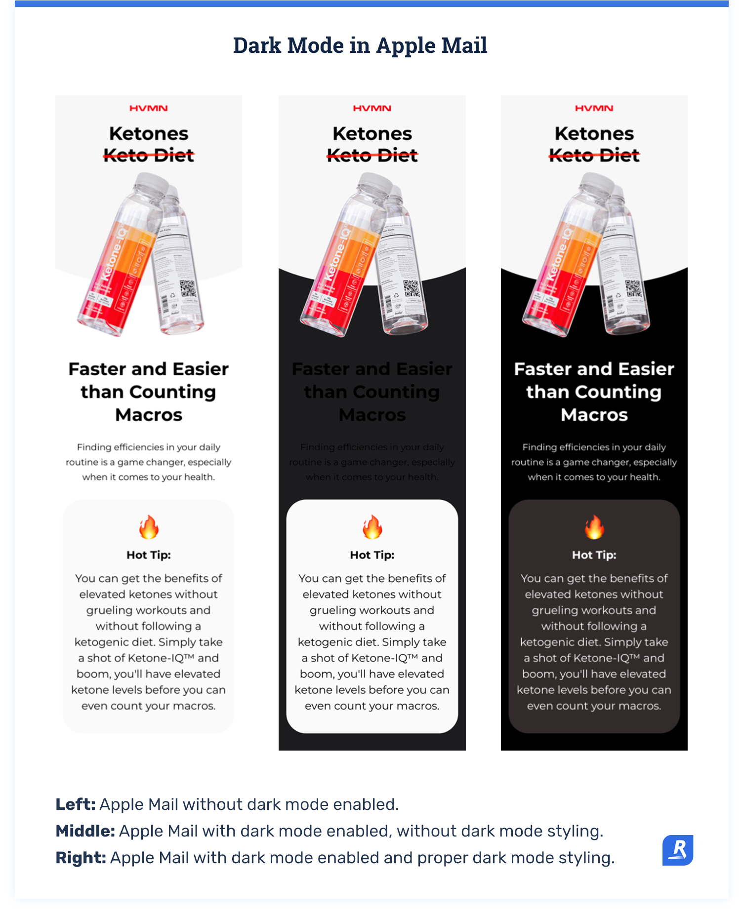
When you have dark mode enabled in Apple Mail, only the background gets inverted and only if the background is white.
Outlook dark mode color declaration code:
This code enables you to specify which colors to display in dark mode and create your dark mode styling for Outlook.
Adding these lines of code only impact how your emails display in Apple Mail and Outlook. You’ll still need to create dark mode friendly images and follow the other fundamentals to make your emails display correctly in all the other email clients.
It’s also worth noting that you should keep your colors dark for your Apple Mail and Outlook dark mode styling. Theoretically, you could specify light mode colors.
Doing this is a bad experience for your subscribers, though. If they have dark mode enabled, they want dark mode enabled. Using your dark mode styling to essentially force light mode in Apple Mail is a bit disrespectful.
What not to do in dark mode emails
Based on how dark mode works, it’s natural to assume that you could do a couple of things to exert more control over how your emails display in every email client.
However, it’s not as easy to manipulate how your emails display in dark mode as it might seem. It’s better to establish design standards that account for dark mode than to try to somehow dodge dark mode.
Resist the temptation to use these techniques for dealing with dark mode.
Image swapping
It’s possible to develop emails that display different images in dark mode. However, hiding HTML elements based on dark mode is tricky, because your email code must correctly detect dark mode in all the different email clients.
More than likely, you’ll end up with both the light and dark mode images showing up in at least some email clients.
The whole point of designing emails to display in dark mode is to avoid having email display incorrectly for some portion of your subscribers. A solution that causes your emails to display incorrectly for some portion of your subscribers is simply ineffective.
Trying to control how dark mode changes colors
First, it’s just not possible to force light mode. However, you can control how dark mode inverts colors in some email clients, but not all email clients.
Also, even in the email clients where you can change how dark mode looks, it often requires email development hacks that are unreliable.
Then, if the email client issues an update that causes the hack to stop working or changes how you control dark mode, you have to update the code in all your emails. This creates a ton of work for your email development team whenever there’s a client update that changes what you can do with dark mode.
It’s much more reliable and efficient to implement a standardized process that accounts for dark mode overall, rather than using hacks to control how dark mode looks in certain email clients and maintain all of your emails as clients get updated.
Develop emails for dark mode as a standard
Dark mode might be considered a growing trend, but the reality is that it’s already here. Add standard actions to your email production process to optimize your emails for dark mode.
If you use design principles to prep your emails for dark mode as a standard operating procedure, you won’t have to create a complex set of color guidelines or design instructions. Then you can rest assured that every email you roll out will look great in dark mode.
What to do now
Did you find this article about dark mode helpful? Subscribe for more informative content just like this one.
Learn how to build an email production workflow that reduces email problems and increases production.
Stop trying to wrangle your email creative so that it consistently looks right in dark mode, and let Rejoiner handle dark mode development (and everything else).

